Brian Perel
Contact Information: Phone: (508)-215-**** Email: bperel@student.framingham.edu
Address: 723 Maple Drive, Los Angeles, CA, 90210
My Websites
Welcome to my portfolio websites page. Here you will find screenshots and reflections of my websites from my web site development course. Over the course of the class, I created a coffee shop website, a lawn care website, and this portfolio to showcase my skills and work. For each project, you will find a description and reflection in which I explain what worked, what didn't work, how I could have improved these projects and a link.
1. Coffee Shop Website
My Coffee Shop reflection:
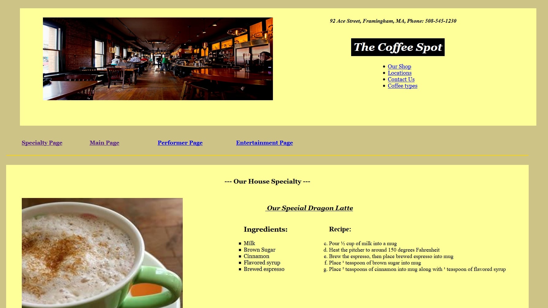
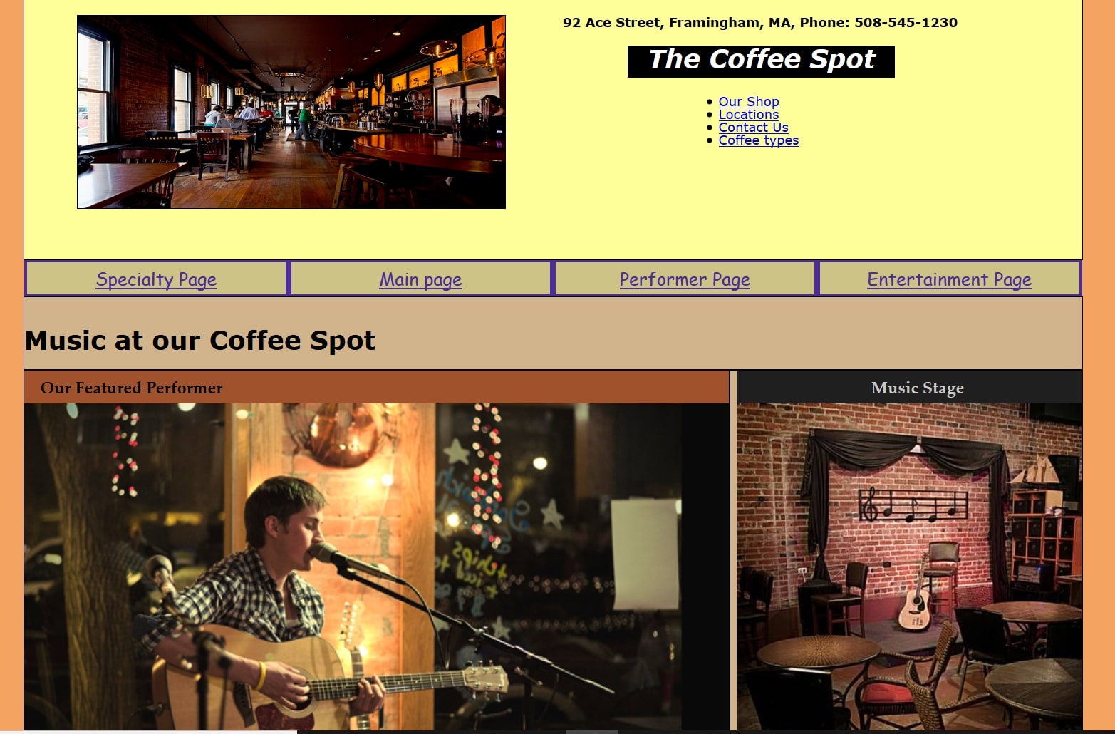
This was a 4-part project in which I created a homepage, a specialty page, a performer page, and an entertainment page for the coffee shop. What I think worked well were the choices I made in choosing the right colors and layout for the website. What I think didn't work well was the placement of some of the content on the sites. I suppose with more experience I could blend my pages to have a more professional look. If I was given more time on this project, I would expand each page a bit more.
For the main page of the site, I provided ID bookmarks that link to the various sections of the page, locations, hours open, an about us section, and coffee drinks that we offer. For the Specialty page, I provided information about a special signature coffee drink the shop provides including its ingredients and recipe instructions. The Performer page discusses the setting of the stage in the shop and information about the music performer that comes to perform. The entertainment page lists the show times of the various entertainers that come to perform throughout the months. The site is about a superb coffee shop serving unique drinks.
Coffee Shop website link
Coffee Shop website screen shots:
2. Lawn Care Website
My Lawn Care site reflection:
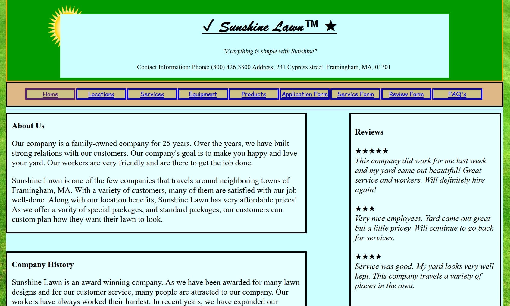
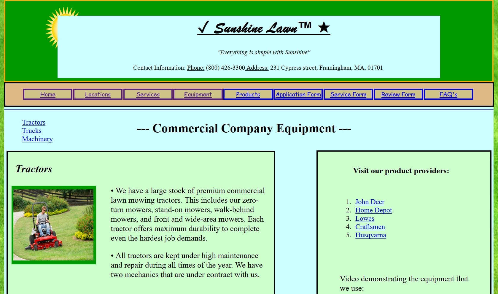
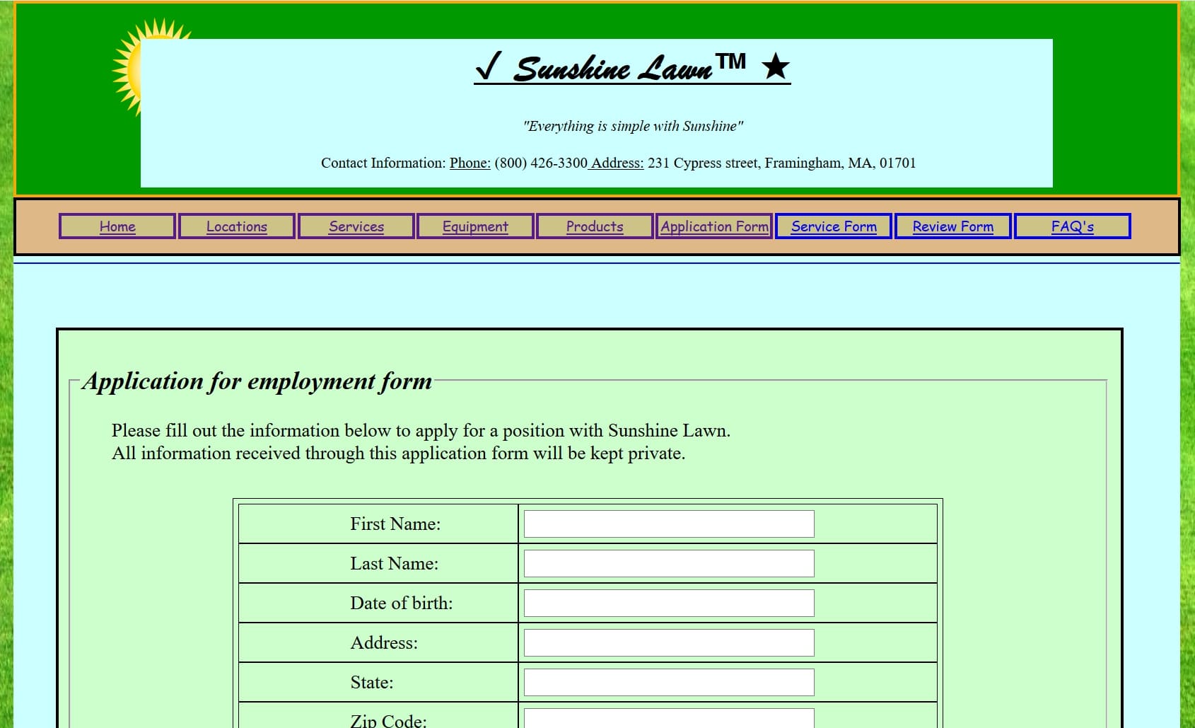
This was a 9-page group project site. The team members were Sean Lackeryram-Owen and Shannon Mattson. Each member created a form page and 2 other significant pages. Taking place over a 3-week period, our team worked together to produce our lawn care site. What I think worked well was the placement of the background image of a grass field, having an abundant amount of content for the site, and having good quality pictures for the site.
What I think didn't work well in the project was the excessive amount of boxes I used and some wrapper difficulty I experienced. If I was given more time for the project, I would provide more information on the services our company provides. I would also talk more about what we do during different seasons. Overall, this was a fun project where I got to gain a lot of experience with HTML and CSS formatting and styling.
Lawn Care website link
Lawn Care website screen shots
3. My Portfolio Website
My Portfolio site reflection:
For the portfolio I am displaying my web development skill set attained through this class. What I learned is that web development is a creative field that is largely about formatting and styling your web content. Choosing good color combinations, tiles, the right information to display, and an attractive layout seems to come with experience. I've found that small marketing and art skills are a plus in web design.
What I thought worked well for my portfolio was the choice of colors and layout I picked. Overall, the Eportfolio was a great way to bind all my projects and display the impact this course has had on me. The course allowed me to grow in all the base areas of web development. Now there are many job pathways I can pursue within this realm.
My Portfolio website link
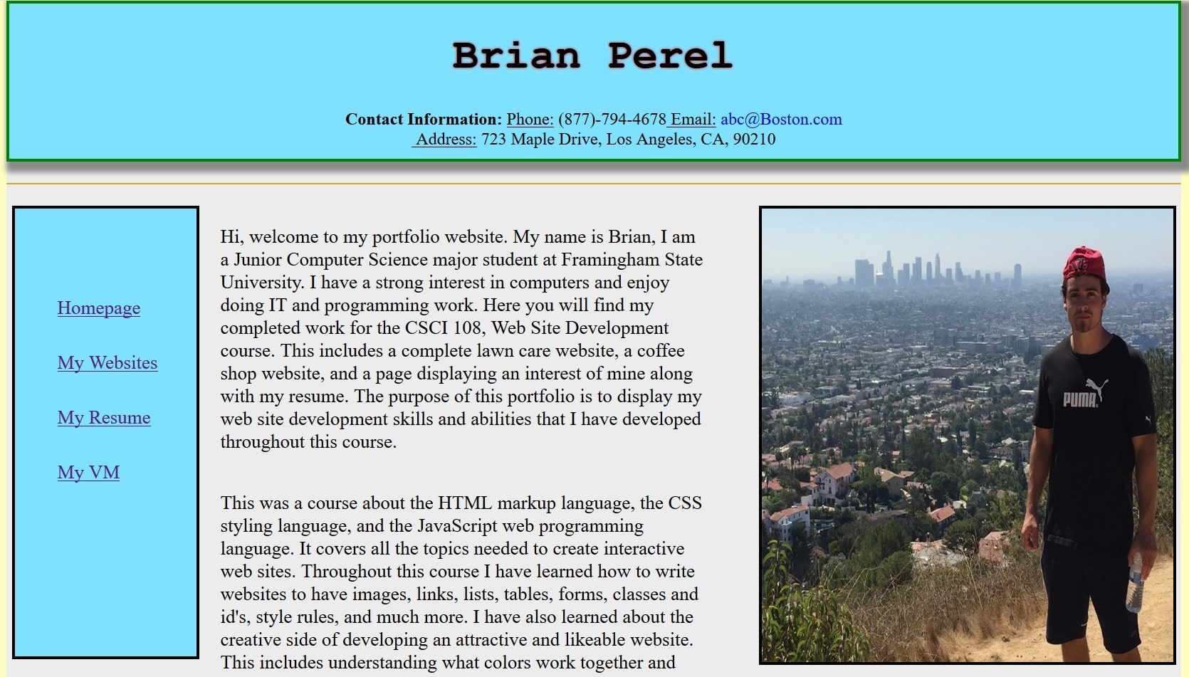
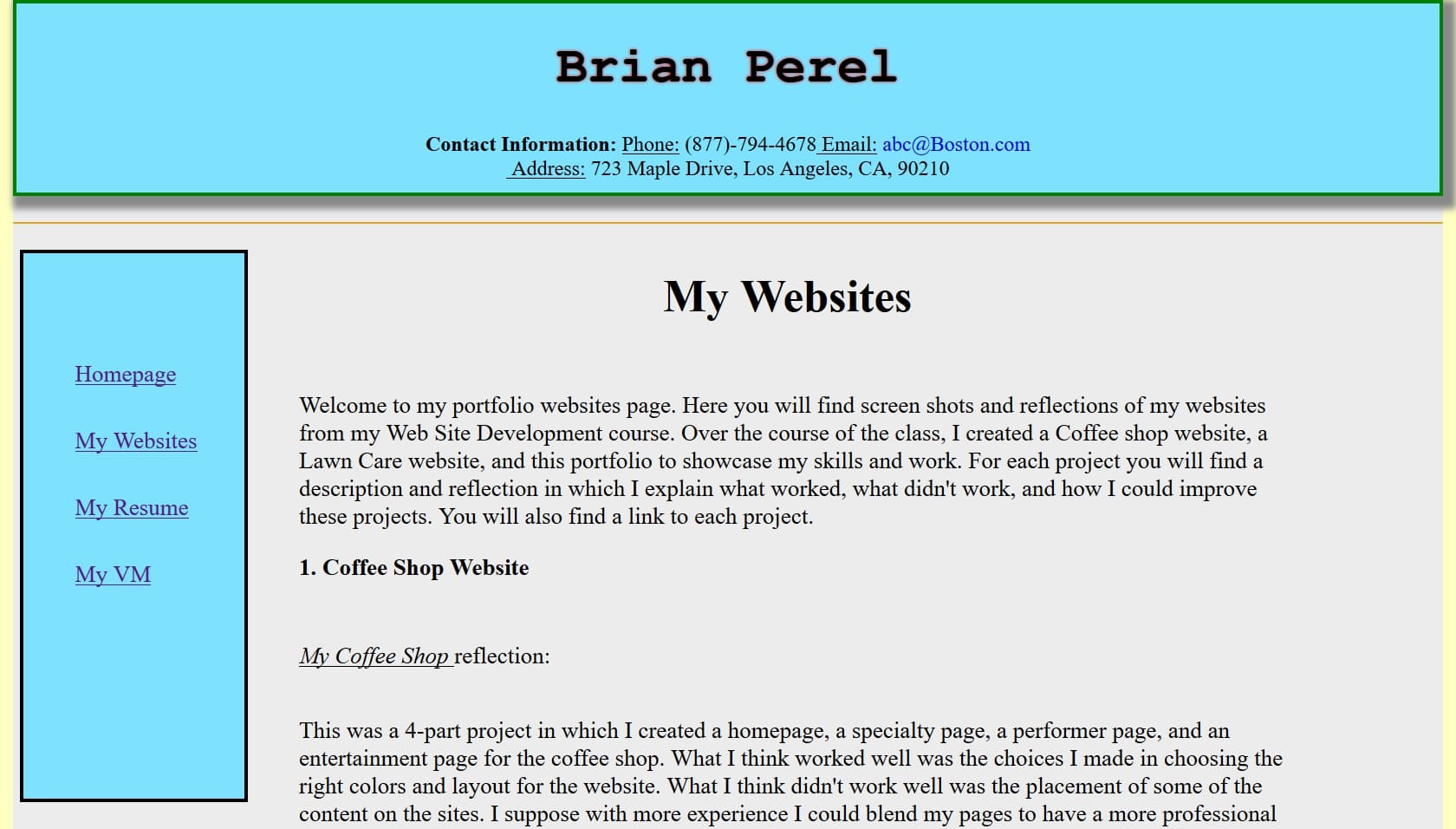
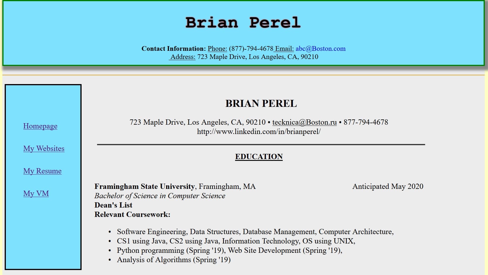
My Portfolio site screen shots
